HOW A HARLEQUIN COVER GOT MADE
Step One
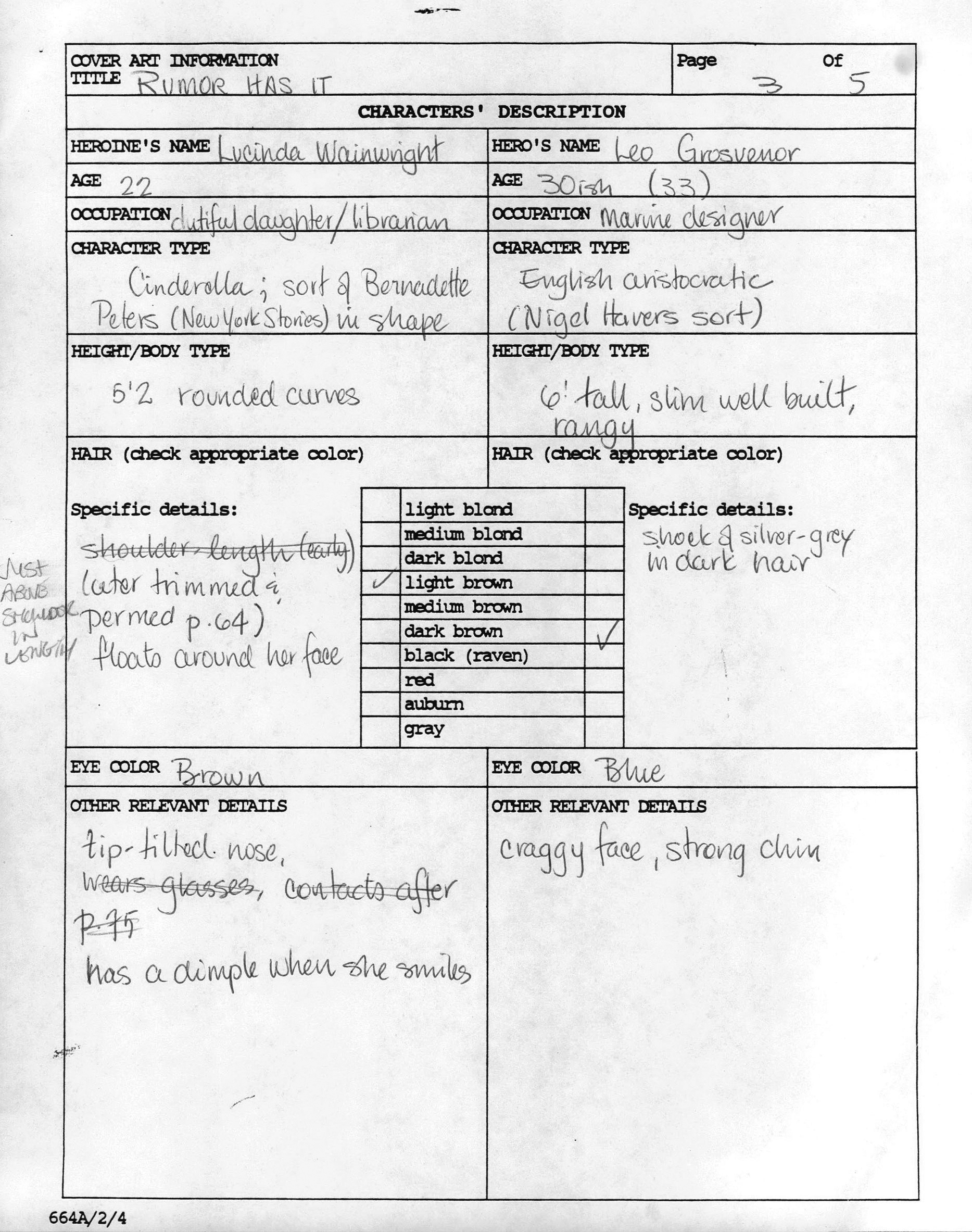
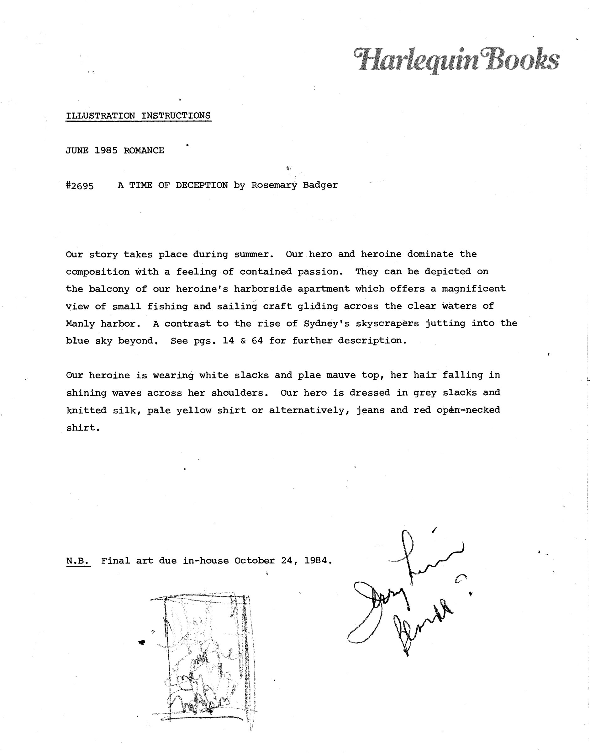
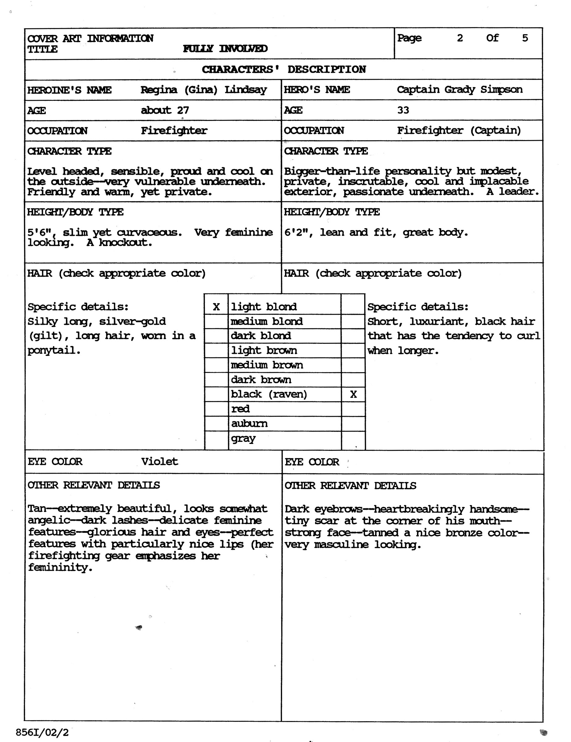
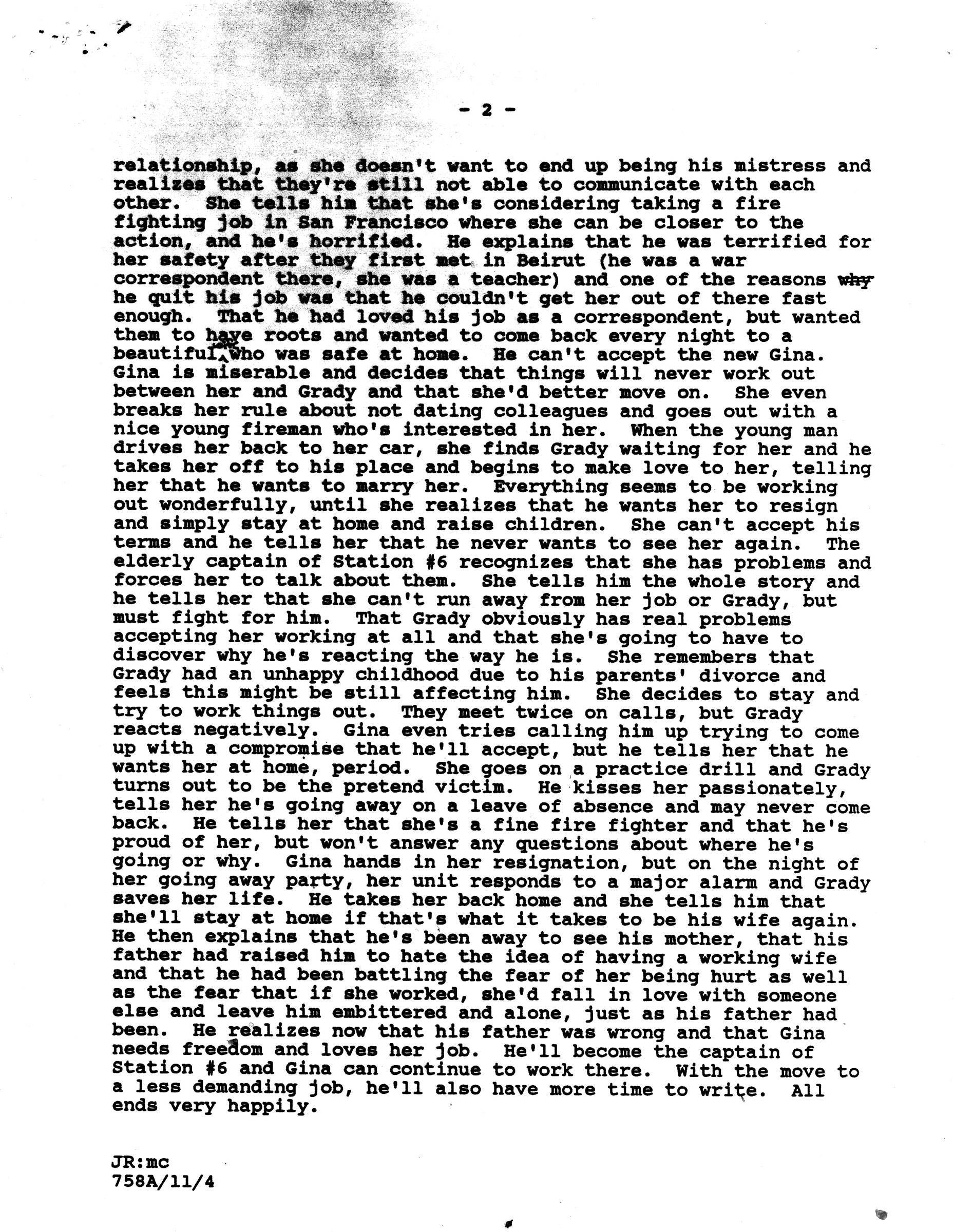
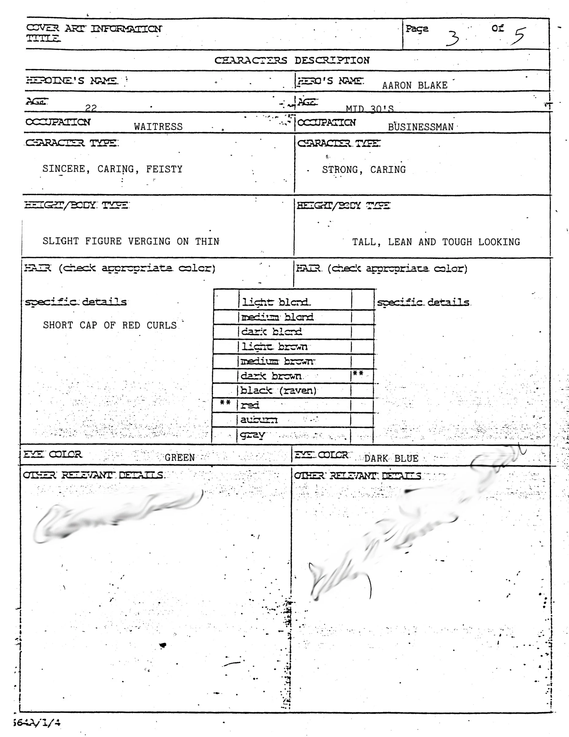
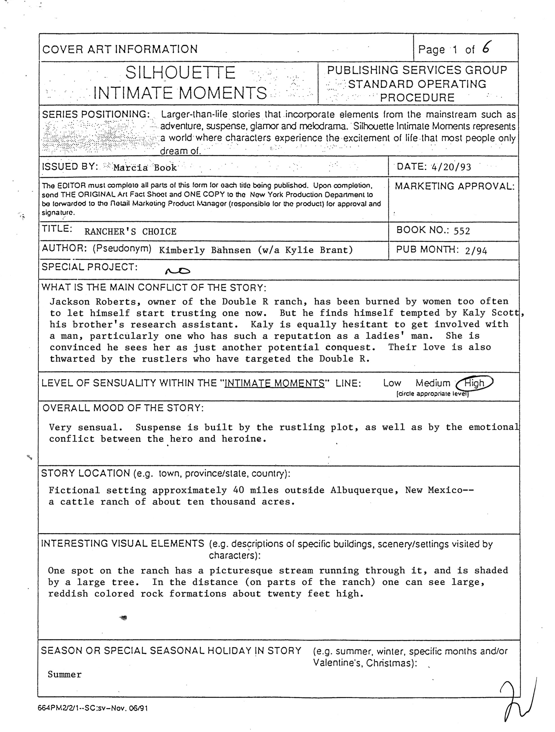
Art Director’s Notes
Ideas for a cover typically began with a meeting between the art director (AD), editor and others responsible for the sale of the book. The team worked with author scene suggestions but also had to consider brand, other titles being published that month, and the all-important intangible: what they knew the reader would want.
With concept in hand the art director would then complete “standard operating procedure” cover notes to convey mood, setting, level of sensuality, props, poses and other information to the artist. A letter often accompanied the notes to stress exactly what the cover needed to convey. Harlequin editors have always known what attracts readers to a particular line category and how to build a book-buying habit. As such the cover is an ad campaign as much as it is an illustration; details are important.
STEP two
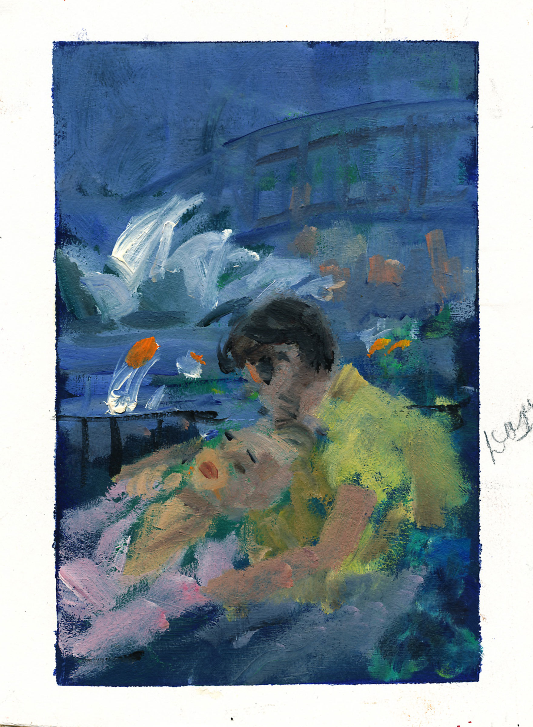
preliminary sketch
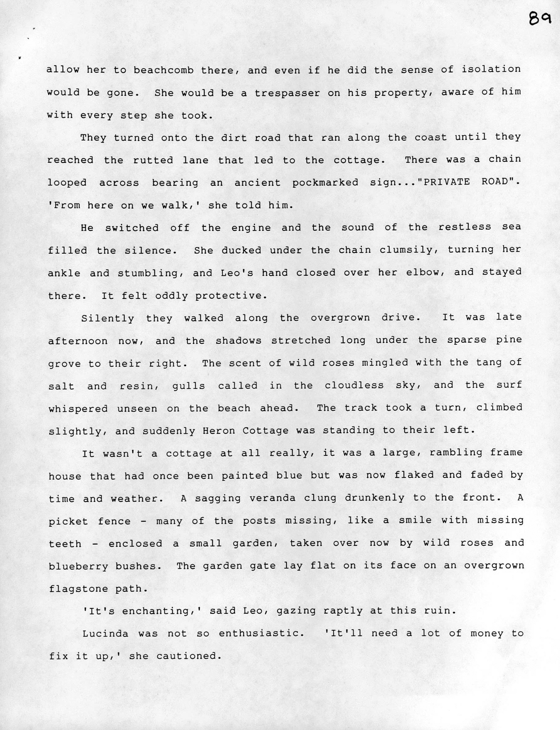
Clippings room at the New Rochelle Public Library
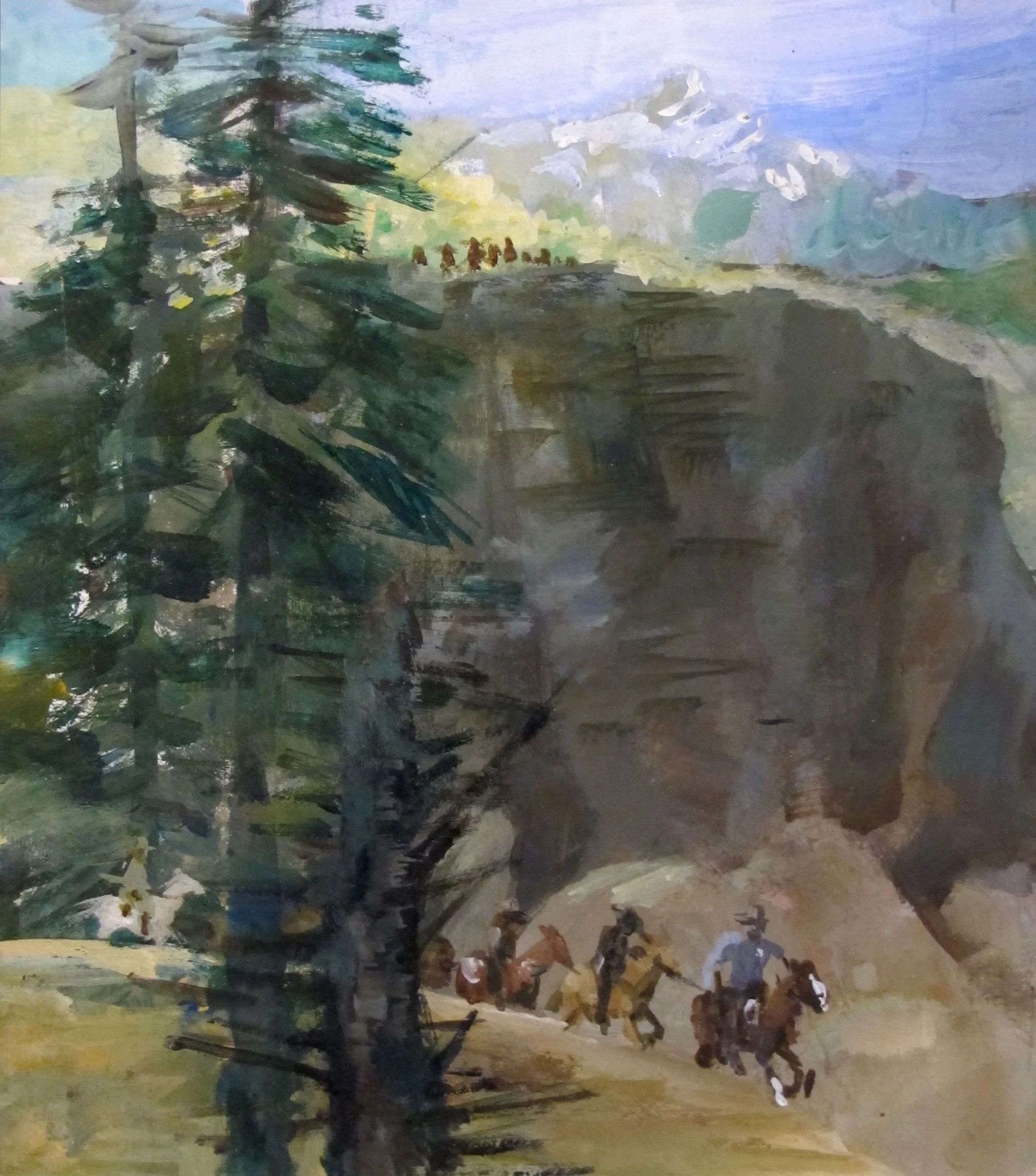
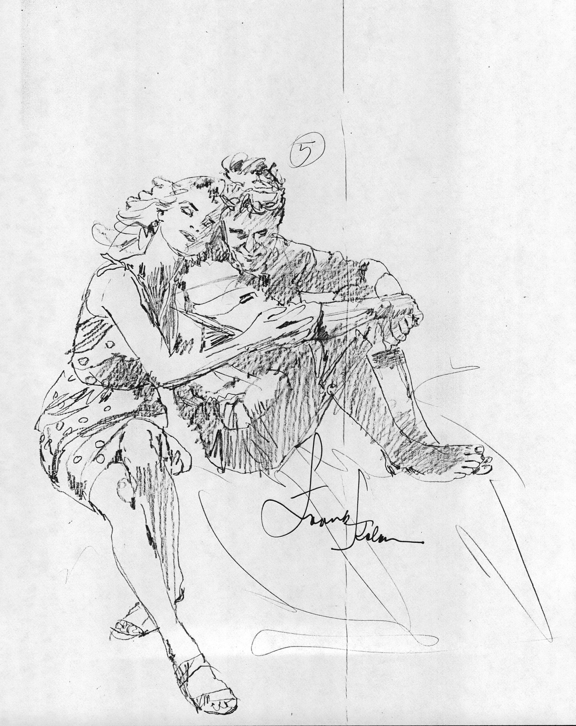
Based on these notes and reference materials, the artist would work up various preliminary sketches to test out poses, layout options and color palettes. In Frank’s case these were small (3x5 or 4x6), quick, loose works that he would use to provide direction for the cover shoot and cover design. For specific reference materials (mountain scenes, international locales, a type of house) Frank visited the clippings collection at the local library or used his own collection of Smithsonian and National Geographic magazines.
STEP THREE
COVER
SHOOT
With preliminary sketches in hand the artist would stage a cover shoot using models and props to capture required poses and expressions. In Frank’s case he also served as the photographer, using a Rolleiflex 4x4, working out of Addie Passen’s Union Square studio and later at Michael Frost’s. From dozens of negatives, Frank selected 2-3 to blow up in various exposures and refer to during the painting process. Finding the right models and getting the right shot was crucial; the outcome could make your job significantly easier or present real challenges.
STEP FOUR
THE
SKETCH
Though a special job with high sales expectations could require a comprehensive layout (or comp, for short) most of the time the artist would next do up two sketches for approval using reference material from the shoot. These would be mailed or faxed to the AD, sometimes including pose photos from the shoot, after which the AD and artist would talk and make any necessary changes. The illustrator would begin the final piece after receiving approval from the AD.
STEP Five
Final
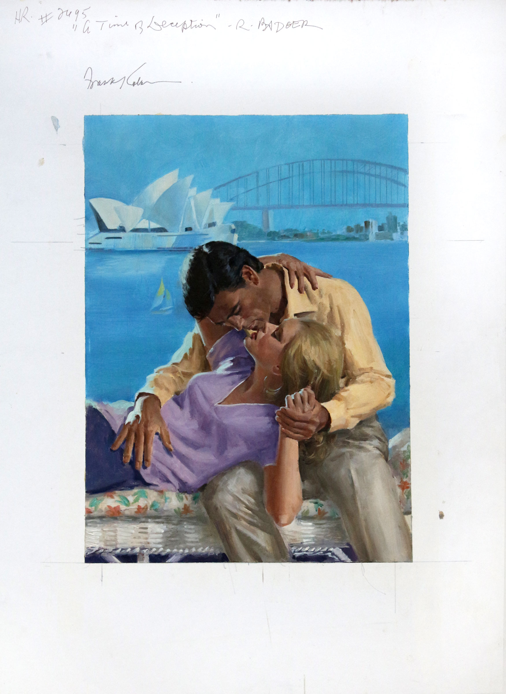
artwork
Once the artist completed the illustration final product was sent to Toronto. At one time the art was physically mailed; later, to save space and avoid lost product, the illustrator would mail two 4x5 color transparencies instead. One transparency was filed and the other used in the production of the cover. On occasion an alteration to the artwork would be required, along with new transparencies, but this was an exception rather than the norm. Harlequin worked with a team of skilled professionals who knew how to get the job done right.
STEP SIX
FINAL
COVER
With artwork in hand the art team would add the series logo, book title and author name to create a “complete cover,” and the author would finally get to see how the book would appear to a potential reader. Most of the time, everyone was happy.
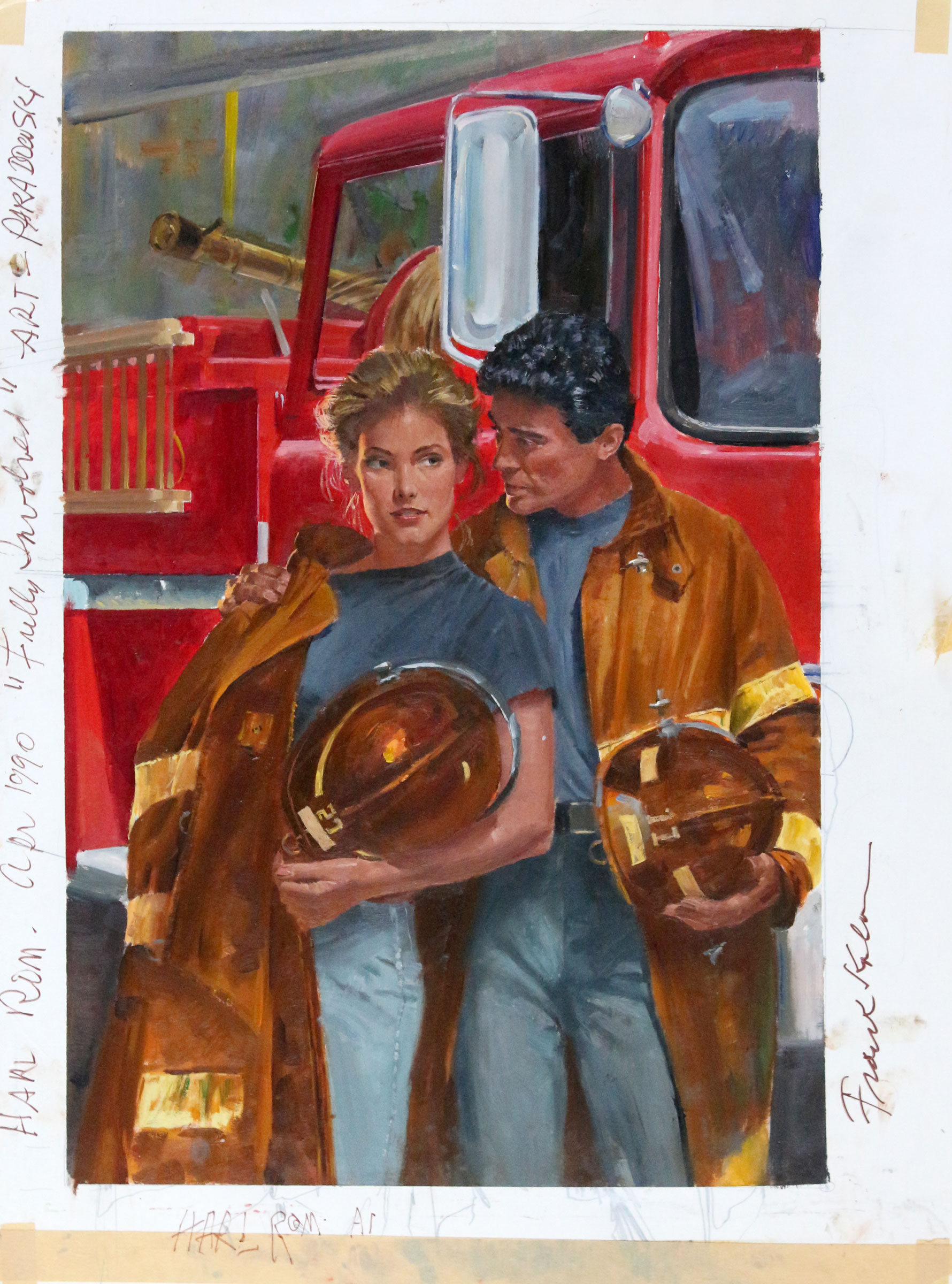
This process repeated itself across multiple art directors and artists as Harlequin (at the time) published upwards of 40 titles per month. Frank usually had one or sometimes two covers going at a time, and frequently worked late into the night. It was a lot of work to keep up with readers who could finish a novel a day; sometimes the paint barely had time to dry.
ADDITIONAL EXAMPLES
a time of DECEPTION
Rosemary Badger, 1985
fully involved
Rebecca Winters, 1989
GOLDEN BAY
Gloria Bevan, 1986
LOVESPELL
Jennifer Taylor, 1990
MOUNTAIN LOVESONG
Katherine Arthur, 1988
NEVER GO BACK
Anne Weale, 1994
RANCHER'S CHOICE
Kylie Brant, 1994


